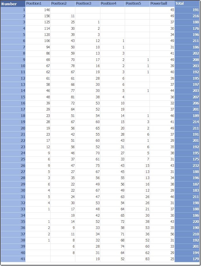
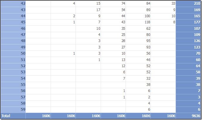
So I am a complete nerd about data. I got lottery data from 1994 to today and decided to visualize it just to see what it shows. I was surprised by the results. Hope you can see the beauty of “random”. I will try and get more visualization at a later by including dates in the equations. Enjoy.
Update (8/28/09) – New Visuals
I created a new visual to show the pattern I was observing (which is really obvious if you think about it). Number 1 is heavily skewed to the lower numbers, Number 2 is skewed to the lower numbers but not as badly and has a nice hump at the 11 mark. Number 3 is almost like the bell curve with similar distributions on both sides. Number 4 skews a little to the higher numbers. Number 5 is skewed heavily to the higher numbers. Finally the Powerball number is an even distribution but I do see some falloff at the end.
Now why does this make sense? Because the numbers are organized from lowest to highest in position 1 through 5 of course!
Stay tuned for more visualizations coming soon!


Hmm, this is interesting. Trying to understand one thing, though. When you say “Position 1”, do you mean the first ‘tube’ or whatever the balls appear into? Or by “Position 1,” do you mean the position where they’d be on the print-out on your Powerball ticket? I’m guessing its the latter.
I’d be interested to see (not sure if the data is readily available) the position of the numbers as they come out (i.e. first number ‘drawn’ is ‘Position 1’). My guess would be that you’d have much more even graphs in that case.
Yep. Position 1 is the first ball picked and so on. So what you are seeing is the skew that is actually occurring with balls as they are picked in order.